Over a year and a half ago I switched from Blogger to WordPress, two-column template to magazine layout.
Moving to WordPress was the best decision I ever made for my blog (note to Blogger bloggers: my traffic doubled shortly after I switched to WordPress).
My initial drive to move to the magazine layout was that I was ambitiously planning on posting multiple times in a day. I wanted my blog to become an online zine of sorts, where one could find plenty of posts on Austin lifestyle, fashion, pop culture, etc.
Yeahhhh….that didn’t happen.
Blogging every day is hard. Blogging multiple times a day is really hard.
The zine idea I had was more appropriate for a team of writers and not one pseudo-writer who spends her days holed up on the couch in her sweatpants. I guess if I wanted to take Hipstercrite to that level, I could have, but I kind of just like blogging whatever the hell I want to whenever the hell I want to (i.e. don’t fix something if it ain’t broken).
So….with that being said, I’ve decided that it’s best that I go back to a two or three-column blog layout.
Before I do so, I would love your feedback!
Do you prefer the magazine layout or shall I return to the more traditional personal blog layout of two to three columns?
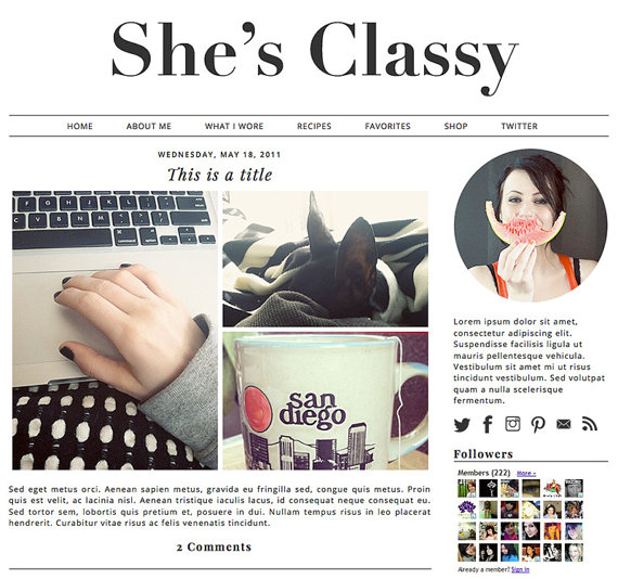
As for the the new template, I was thinking something along the lines of this? I prefer minimalistic, yet with customized branding to show uniqueness.
What do you think?
You guys have been so supportive through the years and I value your opinion and always appreciate your feedback!
OR do you have a different layout idea that you think would work even better?
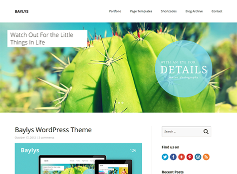
On a side note, as I’ve been rummaging the Internet for layout designs, I came across this awesome German design company, Elma Studio, that creates killer WordPress templates. Check out this beautiful template.


13 Comments
Hi! 🙂
I loved the old two column design, it was so much easier to navigate. (But I am a real ole lazy pants when it comes to reading stuff online.)
I prefer traditional blog designs because I think it keeps it personal whereas the new design made it feel a lot more like a website.
I have a quick Q about your move from Blogger. How difficult/easy was it to transfer your content? Did you lose photos or anything in the change over? Because I’ve heard that WordPress doesn’t import photos from Google.
Love your work! I will keep reading no matter what you do with your redesign. Good luck.
Love,
Tish
Thanks for the feedback, Tish!
For the transfer- it is super simple. I could have done it, but was petrified I’d screw it up, so I had a web friend help me. Both on Blogger and WordPress there are migration tabs in the admin. Here are some links!
http://wordpress.org/extend/plugins/seo-blogger-to-wordpress-301-redirector/
http://www.labnol.org/internet/switch-from-blogger-to-wordpress/9707/
Now I’m really kicking myself for missing your blogging class! I thought about switching to WordPress but the thought of having to find my own hosting scared non-developer-me. So i bought my domain through Blogger which may mean I’m stuck there for now.
I like the magazine layout for your blog because it really does read more like a ‘zine. Your content is much better suited towards that style than a plain ol’ 2-column layout.
Blogger is not bad and you’ll find a lot of great things about it. It has a wonderful community.
Wordpress is more SEO-friendly, I find.
You can always transfer over later! Let me know if you need help and I can point you in the right direction!
Thanks for the feedback too!
Hi,
I’m only getting started with this blogger stuff, and I’m not sure if I should use blogger or wordpress? I really like your layout, where is it from?
Could you please give me a few tips on how to get started?
Thank you
I love the She’s Classy layout. I’m in the market for a new design too. I love layouts that look kind of newspapery in their header. Lots of white space is good.
Same here! That is why I picked this magazine layout before. I love black & white. What sort of layout are you thinking for yourself?
I love the 2 or 3 column layout. I find that before I subscribed to you on my reader, I would miss posts in the current template.
Also, after your blogging class, I decided on wordpress. I’m not self hosting yet, but I did buy a domain, and at least blogging on the free part of wordpress is a step in the right direction.
Yeah, I prefer two column layout as well and think your blog would read more easily with it.
The pictures you posted both look like great templates to model something after – especially She’s Classy…it’s just so…err, classy.
I think simplicity always wins.
I love this layout, but I think going back to two column is good. I could say something about navigating or ease of use but honestly…… I’m worried that you’ll beat yourself up about having a magazine layout and not being a magazine. Let’s be honest- you can be a leetle hard on yourself. I do think the design you shared is lovely as well. Just promise the picture of you and your mustache ring is staying!!
I agree with the people!
I love the She’s Classy one. I think it suits you, and I love the clean & fresh look of it.
I like the “She’s Classy” layout better. The layout is clean, simple, and it seems easy to navigate. I think that placing the pictures at the center would be a great and effective way of attracting visitors to your site too because people are very visual.
there’s tons of free, responsive themes out there. Here’s a good resource http://speckyboy.com/2012/12/27/minimal-responsive-wordpress-themes-2012/